
This resource provides the official Booking Holdings brand guidelines, logos, media assets, and usage standards for journalists, partners, and approved third parties. Use these materials to ensure accurate, consistent representation of the Booking Holdings brand.
Brand Guidelines
Booking Holdings Brand Guidelines & Media Kit
Terms of Use
By accessing or downloading these materials, you agree to the Booking Holdings Brand Guidelines and Terms of Use. Brand assets remain the property of Booking Holdings and may only be used as permitted for approved editorial, partner, or authorized business purposes.
Logo
The suite of logos includes primary lock-ups that include key brands and secondary core logos that serve as the base logo elements.
All logo sets provided on this page include full color and knockout. For logos that include our brands, a knock-out with brands in color is also provided.

Logo: Dot B
The Dot B communicates Booking Holdings focus on technology, and the range of experiences we connect people to around the world.
Core Logos
Core logos are used only with permission provided by Booking Holdings.


Logo: Minimum Size
For both Digital and Print use it is recommended to use vector formats of the logo which will avoid dithering around the dots within the Dot B mark. The minimum sizes can only be achieved with a vector based logo. Do not attempt these sizes with PNGs or JPGs.
For Digital – SVGs
For Print – .eps, .pdf, .ai


Logo: Cobranding Permissions

All external use of the Booking Holdings brand must be reviewed and approved in advance. Third parties should coordinate approvals through their Booking Holdings contact, who will route materials through the appropriate internal teams. Third parties may use the Booking Holdings logo only for approved purposes and must follow these guidelines. All uses must be accurate, not misleading, and must not imply endorsement without prior written approval.
Guidance for third parties or vendors
Use is permitted only for approved purposes (e.g. promoting a partnership, referencing a commercial relationship), to be agreed in writing directly with Booking Holdings
Must not imply endorsement, sponsorship, or ownership unless explicitly agreed
Cannot be used in a way that is misleading or damages the brand
Vendors must use provided, up-to-date logo files
All standard branding rules apply (color, spacing, sizing, background, etc.)
Logo: Co-Branding Guidelines
Similar size/weight
Use a version of the Booking Holdings logo that feels similarly weighted to the cobranded logos. For example: if the partner logo is stacked, use the Booking Holdings stacked version. This keeps the visual weight of the logos as close as possible.
Clear Space
Provide significant clear space (3x width of the Dot B) between the two logos so it isn’t implied that a new combination mark has been created.
Avoid adding graphic elements
to create lock-ups as this may read to the viewer as a new logo/mark.

Logo: Dos and Don’ts

Do not distort proportions
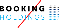
Do not change placement of the Dot B Mark
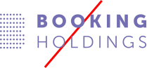
Do not change colors
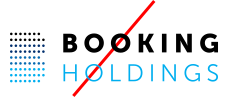
Do not add effects such as drop shadow
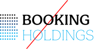
Do not change or modify font
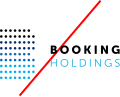
Do not change the scale
and relationship of the logo elements
Color: Primary Brand Colors
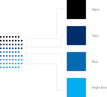
These colors are core to our identity and help people quickly identify our brand. They should be used first and consistently to strengthen brand awareness. Additional blue values are available for when sequential graphics are needed
= Primary Palette
| Black | Hex Value #000000 | CMYK 0 0 0 100 | RGB 0 0 0 | PMS Neutral Black |
| Navy | Hex Value #002E6D | CMYK 100 69 7 30 | RGB 0 46 109 | PMS 294 C |
| Blue 80 | Hex Value #134B98 | |||
| Blue | Hex Value #076AB1 | CMYK 90 48 0 | RGB 7 106 177 | PMS 285 C |
| Bright Blue | Hex Value #00AEEF | CMYK 100 0 0 0 | RGB 0 174 239 | PMS Process Cyan C |
| Blue 30 | Hex Value #66D1F5 | |||
| Blue 20 | Hex Value #93E2FF | |||
| Blue 10 | Hex Value #E9F7FC | |||
| White | Hex Value #FFFFFF | CMYK 0 0 0 0 | RGB 255 255 255 | PMS Bright White |
Neutrals
| Gray | Hex Value #CCCCCC | |||
| Light Grey | Hex Value #EFEFEF | |||
| Stone | Hex Value #EFE3DA | |||
Color: Accessibility and Colors
When using colors, ensure that text that is on top of the color is readable and accessible. This chart shows which colors pass or fail meeting accessibility standards with black and white text.
= Primary Palette
| Black | ⊘ AA ⊘ AAA | ⊘ AA ⊘ AAA |
| Navy | ⊘ AA ⊘ AAA | ⊘ AA ⊘ AAA |
| Blue 80 | ⊘ AA ⊘ AAA | ⊘ AA ⊘ AAA |
| Blue | ⊘ AA ⊘ AAA | ⊘ AA ⊘ AAA |
| Bright Blue | ⊘ AA ⊘ AAA | ⊘ AA ⊘ AAA |
| Blue 30 | ⊘ AA ⊘ AAA | ⊘ AA ⊘ AAA |
| Blue 20 | ⊘ AA ⊘ AAA | ⊘ AA ⊘ AAA |
| Blue 10 | ⊘ AA ⊘ AAA | ⊘ AA ⊘ AAA |
| White | ⊘ AA ⊘ AAA | ⊘ AA ⊘ AAA |
Neutrals
| Gray | ⊘ AA ⊘ AAA | ⊘ AA ⊘ AAA |
| Light Grey | ⊘ AA ⊘ AAA | ⊘ AA ⊘ AAA |
| Stone | ⊘ AA ⊘ AAA | ⊘ AA ⊘ AAA |
Color: Primary Consumer Facing Brand Colors

Typography: Primary Font


Typography: Font Substitution
For cases when Museo Sans is unavailable, we can opt for a substitution.
Preference Order
1H1
Museo Sans
Body
Lorem ipsum dolor sit amet, consectetur adipiscing elit, sed do eiusmod.
Caption
Lorem ipsum dolor sit amet, consectetur adipiscing elit, sed do eiusmod.
Preference Order
2H1
Montserrat
Body
Lorem ipsum dolor sit amet, consectetur adipiscing elit, sed do eiusmod.
Caption
Lorem ipsum dolor sit amet, consectetur adipiscing elit, sed do eiusmod.
Preference Order
3H1
Trebuchet
Body
Lorem ipsum dolor sit amet, consectetur adipiscing elit, sed do eiusmod.
Caption
Lorem ipsum dolor sit amet, consectetur adipiscing elit, sed do eiusmod.
Preference Order
4H1
Helvetica
Body
Lorem ipsum dolor sit amet, consectetur adipiscing elit, sed do eiusmod.
Caption
Lorem ipsum dolor sit amet, consectetur adipiscing elit, sed do eiusmod.
| Preference Order | H1 | Body | Caption |
|---|---|---|---|
| 1 | Museo Sans | Lorem ipsum dolor sit amet, consectetur adipiscing elit, sed do eiusmod. | Lorem ipsum dolor sit amet, consectetur adipiscing elit, sed do eiusmod. |
| 2 | Montserrat | Lorem ipsum dolor sit amet, consectetur adipiscing elit, sed do eiusmod. | Lorem ipsum dolor sit amet, consectetur adipiscing elit, sed do eiusmod. |
| 3 | Trebuchet | Lorem ipsum dolor sit amet, consectetur adipiscing elit, sed do eiusmod. | Lorem ipsum dolor sit amet, consectetur adipiscing elit, sed do eiusmod. |
| 4 | Helvetica | Lorem ipsum dolor sit amet, consectetur adipiscing elit, sed do eiusmod. | Lorem ipsum dolor sit amet, consectetur adipiscing elit, sed do eiusmod. |
Typography: Guidelines
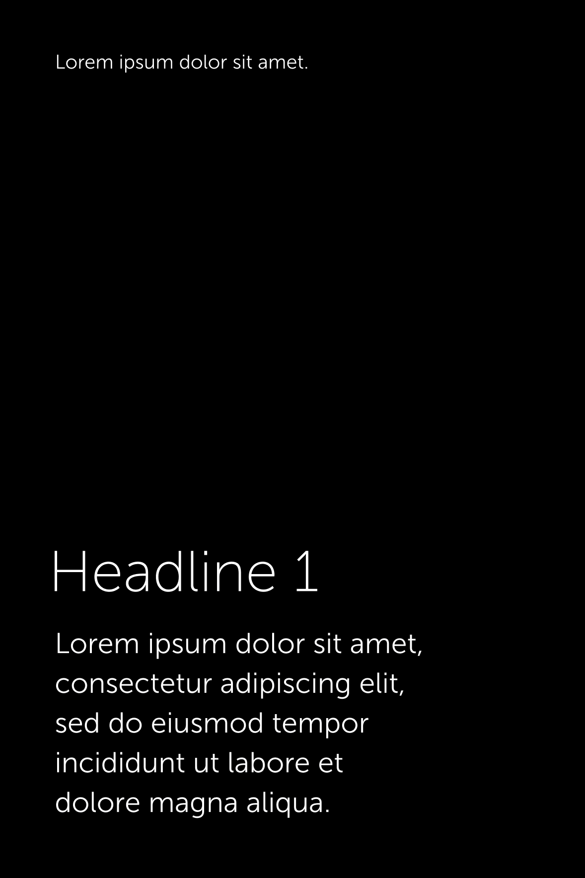
- Minimum size fonts typically should be:
Digital or Web: 16px for body text. 18pt for large text.
Print, Word, or other documents: 10pt - Keep text simple. Avoid excessive italics and bold.
- Limit type sizes, weight, and styles. Maintain a small, consistent set of fonts to aid readability and reduce cognitive load.
- Avoid overly long line lengths in body text, aiming for a balanced paragraph width that supports comfortable, continuous reading without feeling cramped or difficult to track.
- Left, right, or center alignment are possible, however left alignment is preferred. Don’t justify text as this can create uneven gaps between words, making reading harder and less natural.
- Whenever possible, use actual text and not images or pictures of text. Screen readers can skip over images without proper alt text defined. Also, images of text also degrade and become pixelated when high levels of screen magnification are used.
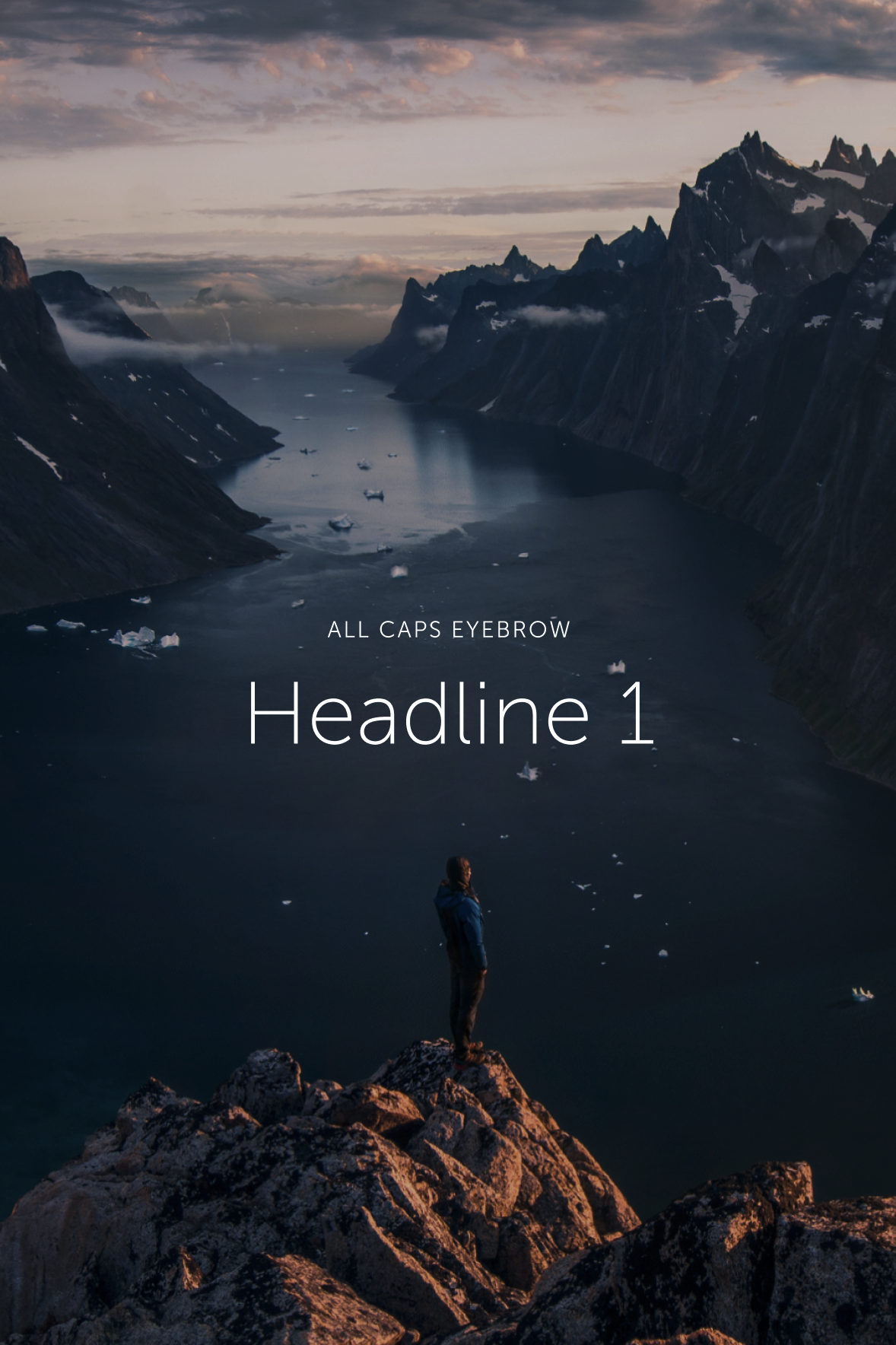
- Text over images needs to pass color contrast requirements which can be difficult to determine if the image is complex. To work around this, be sure to choose images with clear, open areas that text could fit into without being obstructed. Additionally, a 20% black/white overlay can be applied to increase color contrast.


Typography: Best Practices
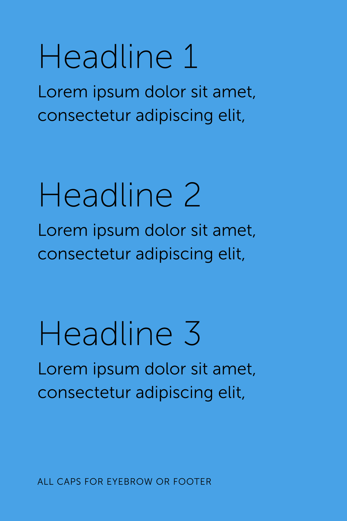
- Headline type should be double the size of body copy when possible.
- All caps can be utilized in eyebrows, footers, and subheads but should not be used for titles and headlines.
- Allow significant spacing between listed items.
- Left, right, or center alignment are possible, however left alignment is preferred.
Iconography: Anatomy of an Icon
The Booking Holdings Icons are simple, unfilled line icons paired with a pattern dot grid*. Icons should be limited to two colors – typically Bright Blue and Dark Navy, but can also be knocked out on a dark background.
*The dot grid should be made of wide and evenly spaced series of dots in which the space between dots is greater than the width of one dot.


Iconography: Anatomy of an Icon
The Booking Holdings Icons are simple, unfilled line icons paired with a pattern dot grid*. Icons should be limited to two colors – typically Bright Blue and Dark Navy, but can also be knocked out on a dark background.
*The dot grid should be made of wide and evenly spaced series of dots in which the space between dots is greater than the width of one dot.

Files provided both in full color and knock out.